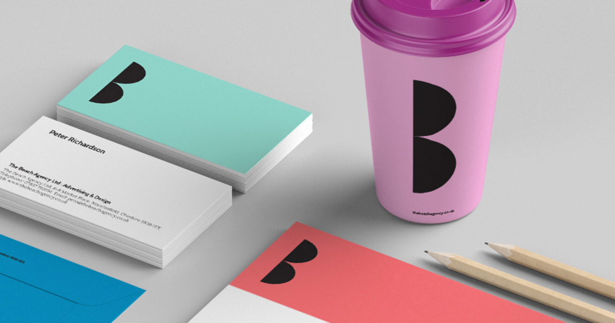
Corporate Identity update
Unbelievably we’ve been in business as the Beach for more than a decade! Time flies when you’re stressed. Since then our logo, which was cool at the time, now looks a little tired, so we thought we’d take advantage of this flipping lockdown to give ourselves a bit of an update. And it has to be said, this new look is much more our kind of thing.
A simple graphic device and some bold colours deliver instant recognition.
A stylised pair of sunglasses makes a B for the Beach, and that’s a very cool image. It’s also easily remembered, beautifully simple and readily adaptable across a range of branded items from letterhead to coffee cup.
Keep it simple...
Which is easy to say but not always easy to do, and in the past we have have certainly been guilty of over complicating. Take this website for instance, the next few images of the logo in action could have been on a slider gallery, on another pop up display, an animated slideshow or something that swirls around. But you know what, simple is best.


